
 Nguyễn Chính Ngọc Liên
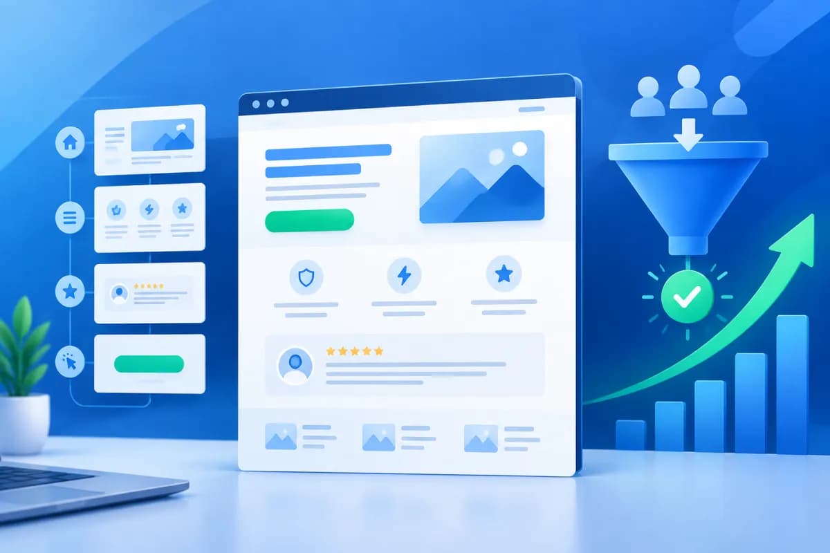
To turn advertising into leads, businesses need more than compelling content: they need a landing page that persuades. To create a high-converting landing page, start by understanding what visitors need, then present the right value, reduce friction, and guide them toward a specific action.
This guide explains how to build a landing page structure, write benefit-focused headlines, and design a form that fits your goals. You’ll also find examples and a checklist to review your page before launching ads or a marketing campaign.
What should a high-converting landing page accomplish?
A landing page is designed around a specific goal, such as booking a consultation, downloading a resource, scheduling a product demo, or making a purchase. Unlike a homepage, which often introduces a range of content and navigation options, a landing page focuses on moving visitors from an initial need toward a measurable action.

“High-converting” does not mean using a design template that guarantees results for every business. Conversion rates depend on many factors, including traffic sources, how well the offer fits, brand credibility, the device visitors use, and content quality. The practical goal is to deliver a clear, consistent experience and improve it over time using data.
Before writing the content, answer these three questions:
- Who is visiting? What problem are they trying to solve, and are they already familiar with your brand?
- What do you want them to do? Choose one primary action as the page’s goal. Avoid putting multiple competing calls to action on the page.
- What might make them hesitate? Price, time, complexity, privacy, or concerns about quality?
For example, a page targeting people researching management software might invite them to book a consultation, while a page for visitors who are closer to buying might focus on requesting a quote. Different levels of readiness call for different content and calls to action.
A landing page structure that guides visitors to take action
An effective structure does not have to be long. Content should appear in an order that helps visitors quickly understand the offer, assess its benefits, address their concerns, and see what to do next. You can adapt or omit sections that are not needed for your product.

1. Above the fold: message, benefits, and CTA
On the first screen, visitors should be able to tell what the page is about, who the solution is for, and what they can do next. Feature a prominent headline, a short supporting description, a CTA button, and a relevant image. On mobile, make sure these key elements are not pushed too far down the page.
2. Describe the problem and introduce the solution
Describe a situation customers commonly face, using language that sounds like the way they would explain the problem. Then explain how your solution works instead of simply listing features. For example, rather than saying “includes automation features,” explain how those features can reduce repetitive tasks in a workflow, if that benefit accurately reflects your product.
3. Clarify the benefits and provide evidence
Choose benefits that directly inform customers’ decisions. You might use a process overview, frequently asked questions, product images, or customer feedback that you have permission to use and have verified. Do not invent statistics or testimonials, or make claims that go beyond what your business can actually deliver.
4. Address concerns and repeat the CTA
Answer questions that could prevent visitors from taking action: What information do they need to provide? What happens after they submit the form? How will their data be used? Repeat the CTA in a suitable spot after providing enough information. Keep its wording and promised benefit consistent each time rather than using multiple buttons with different messages.
For businesses running multiple campaigns, LilyTech can help align content, design, and landing page experience with marketing goals. Whether you build the page yourself or work with a partner, make sure the message is consistent between the ad and the landing page so visitors do not feel they have been directed to a different offer.
Write headlines and CTAs that clearly communicate benefits
The headline gives visitors a reason to decide whether to keep reading. A good headline usually states the main value or outcome customers can expect, while remaining relevant to the audience and the ad that brought them to the page. Avoid vague claims such as “the best solution” unless you have specific evidence to support them.

You can build a headline using this formula: solution or benefit + relevant audience + context. For example, “Centralized order management for growing retailers” is more specific than “Manage sales more effectively.” Use this as a starting point, and replace it with a benefit that you have validated for your product.
The description directly below the headline should add information the headline does not cover: what the solution includes, who it is for, or what visitors will receive after taking the CTA. Keep sentences short and easy to scan, and avoid internal jargon that customers may not understand.
Use a specific action verb in your CTA, such as “Book a consultation,” “Get a free trial,” or “Download the guide.” Make sure the wording matches the actual next step; if the button opens a booking form, do not promise a different action. Color and contrast can make a button easier to spot, but they cannot replace a clear, compelling offer.
Example: For a page inviting businesses to book a consultation about a management solution, the headline could identify the audience and its needs. The description could explain which workflows the consultation will cover, and the CTA could read “Book a consultation.” If the business has established the process, the page should explain how the customer will be contacted.
Design a concise form that makes it easy to sign up
A form turns a visitor’s intent into information your business can act on. A form that is too long can discourage people from completing it, but one that is too short may not collect enough information to handle their request. Ask only for the details needed for the next step, and take the customer’s level of readiness into account.

Choose form fields based on your goal
If the goal is to send a resource automatically, you may need only the contact information required to fulfill the request. If customers are booking a consultation, your business may need an additional field to get a basic understanding of their needs. Every extra field should have a clear purpose. Avoid asking for sensitive information or details that are not needed at the time of sign-up.
Make labels, instructions, and messages easy to understand
Place a clear label next to each input field, identify required fields, and explain the expected format when needed. Error messages should tell users how to fix a problem, not just say that their information is invalid. After successful submission, display a confirmation and explain the next step so users know their request has been received.
Make the experience work on mobile
Check text size, spacing between fields, whether the right keyboard appears for each type of information, and whether buttons are easy to tap with one hand. If the form has multiple steps, show users their progress and do not ask them to enter information they have already provided. Also check page load speed, as a slow experience may cause visitors to leave before they see the content.
Be sure to explain, in concise and easy-to-find language, how your business will use contact information. Make privacy or response-time commitments only if your actual processes can meet them. Transparency helps visitors make informed decisions.
Measure, test, and use this checklist before publishing
Once you create a high-converting landing page, the work does not end when the page goes live. Track metrics that match your goal, such as visits, form submission rate, qualified inquiries, and campaign sources. Conversion rate can be calculated as the number of completed actions divided by total visits within the same measurement scope. Use a consistent tracking method to make accurate comparisons.

If results fall short of expectations, review individual elements instead of changing the entire page at once. You could test the headline, CTA copy, section order, or number of form fields. When running a test, change only one primary element at a time and make sure you have enough data to draw a meaningful conclusion. Do not make a decision based on just a few visits.
Before publishing, review this checklist:
- The page has one primary conversion goal, and the CTA is worded consistently.
- The headline communicates the right value and matches the ad or traffic source.
- Information about the product, its benefits, and supporting evidence is accurate.
- The form asks only for necessary information, has clear labels, and displays a confirmation after submission.
- The page works well on mobile, loads reliably, and its buttons function correctly.
- Analytics tools correctly track form submissions or the target action.
- The content explains what happens next, how customers will be contacted, and how their information will be used, where relevant.
Your analysis should look beyond the number of submissions. If you receive many sign-ups but few qualified inquiries, the issue may lie in your targeting, the offer, or your qualification criteria. Combining page data with feedback from your sales team helps you understand conversion quality, not just quantity.
Conclusion
To create a high-converting landing page, start with customer needs and a clear goal, then build a logical structure, write a specific headline, and optimize the form for the next step. Finally, check the mobile experience, measure actions, and improve individual elements based on real-world data.
If your business needs help building a landing page for a campaign—from content and design to the conversion experience—contact LilyTech to discuss your goals and a suitable approach.

